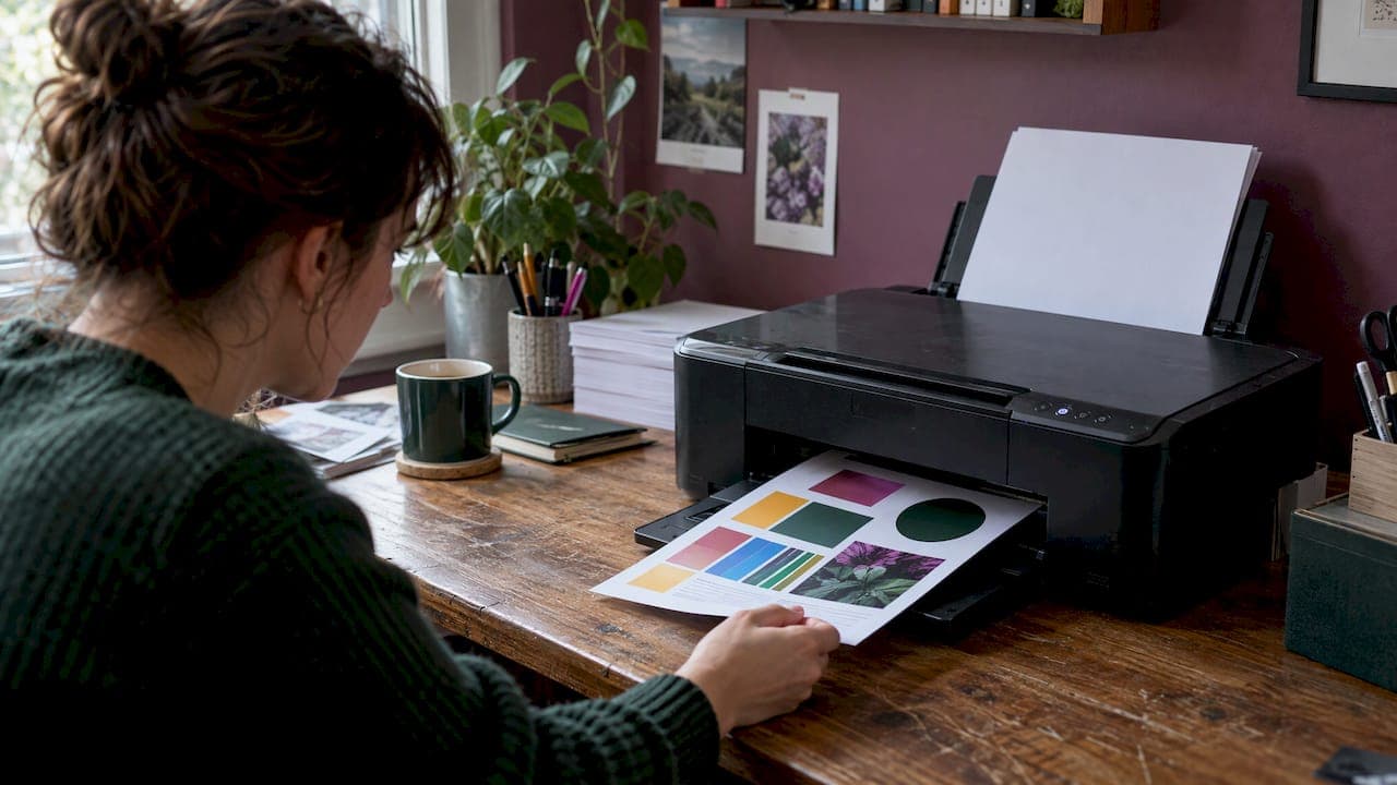
To print in color at home, open the print dialog, pick your printer, switch the color mode from grayscale to color, and set the paper type and quality to match what you loaded. For vivid results, use glossy or coated paper, a high-resolution file, and the "Best" or "Photo" quality setting. This guide covers each step, explains why prints look duller than your screen, and lists what to check when color will not print.
TL;DR
- Color is a setting, not a given. Check the print dialog for "Color" and make sure "Grayscale" or "Black and White" is not selected.
- Match the media type to the paper in the tray and set quality to "Best" or "Photo" for vivid output.
- Glossy paper gives the strongest color. Matte gives a softer look.
- Prints look darker than screens because screens glow with light and ink absorbs it. Work in sRGB and view prints in daylight.
- If color still will not print, check ink levels, run a nozzle check, and clean the printhead.
Table of Contents
- Turn color printing on
- Choose the right type of printer
- Pick paper that brings out color
- Set the quality options correctly
- Prepare the file for vibrant color
- Why prints look different from your screen
- What to check when color will not print
- Printing color pages for kids and classrooms
- Print our Duckwave Decks at home
- FAQ
- Sources
Turn color printing on
Most printers that can print color still default to whatever the last job used. Before you blame the printer, check the dialog.
In Word on Windows
Select File, then Print. Under Settings, choose the color option. Microsoft's guide says the color, black and white and grayscale choices appear when your printer supports them. If you only see black and white, the printer driver may not be installed correctly or the printer may be a black-only model.
On a Mac
Press Command + P to open the Print dialog. Choose your printer, set the copies and pages, and pick color or black and white. Apple notes that the color option depends on the printer supporting color.
In printer properties
Some programs hide the color switch one level down. Select your printer, click Properties or Printer Properties, open the Color tab, and uncheck the Print in Grayscale box. That is the route a university printing guide describes for enabling color.
Choose the right type of printer
If you are buying or deciding which machine to use, the printer type affects color more than any setting.
Inkjet printers suit graphics, color text and photos. According to the ENERGY STAR printer buying guide, color laser printers cost more than inkjets and typically do not match their color quality, while laser printers are best for high-volume black-and-white text.

Resolution numbers point the same way. Forbes Vetted reports that average inkjet resolution starts around 1,200 DPI and many midrange and premium models reach 4,800 DPI, while laser printers started around 300 DPI and now commonly reach 600 or 1,200.
A simple rule of thumb:
| What you print | Better fit |
|---|---|
| Photos, artwork, bright graphics | Inkjet |
| Coloring pages, activity sheets, cards | Inkjet |
| Hundreds of black text pages | Laser |
If you want the most color depth, look for an inkjet. Dye-based inks tend to give brighter, more saturated color but may fade faster in sunlight, as one printable-media guide explains. Pigment-based inks last longer and give more natural tones, which is why a photo-printing guide prefers them for fine art. For everyday home use and classroom sheets that will be used and recycled, vibrancy usually matters more than archival life.
Pick paper that brings out color
Paper is the cheapest upgrade you can make. Plain copy paper soaks up ink and mutes it. Coated paper holds ink near the surface, so colors look stronger.
- Glossy: the most vibrant and saturated color and the highest perceived sharpness. HP's guide says gloss produces strong contrast for photos and image-heavy designs.
- Luster or semi-gloss: keeps most of the color pop while cutting glare, according to this borderless printing guide.
- Matte: absorbs more ink and gives a softer, flatter look with less saturation, per the same guide. It is a good choice for portraits and anything you want to write on.
- Uncoated stock: SmartPress notes that coated stocks give a wider range of color and contrast, while uncoated stocks mute colors. It also recommends whiter stocks.
For kids' activity sheets, plain paper is fine and cheap. For a card deck, a poster or anything that should look special, step up to a coated or heavier stock. If you print cards, our walkthrough on printing and cutting cards at home covers the cutting side.
Set the quality options correctly
The paper in the tray and the paper in the settings need to agree. If the printer thinks it has plain paper, it lays down less ink to avoid soaking and smearing.
- Open the print dialog and go to the printer's preferences or properties.
- Set the media type to the paper you loaded, such as plain, photo glossy or matte.
- Set print quality to "Best" or "Photo" rather than Draft or Standard. HP's guide recommends these two settings together with glossy paper for vibrant color.
- Turn off automatic adjustments that may change contrast or saturation. A photo-printing guide suggests this, along with 300 DPI files.
- Use borderless printing if you want the image to run to the edge of the page.
If your dialog offers a resolution menu, Microsoft explains in its Edge printing guide that 600 DPI is a standard choice for most documents and images, while 1200 DPI generally gives sharper, more detailed prints for photographs and detailed graphics.
Brother's support page adds two printer-side options. Choosing the Vivid color mode is recommended for graphics, charts and text, and its Color Enhancement feature can adjust density, white balance, brightness and contrast on weak-looking pictures. Look for a similar "vivid" or "enhance" option in your own printer's driver.
Higher quality uses more ink and prints more slowly. Use Best for the final copy and a lower setting for drafts.

Prepare the file for vibrant color
Good settings cannot rescue a small, low-quality image. Start with the file.
- Resolution: start with an image at 300 DPI or higher at the size you plan to print. Stretching a small web image to fill a page makes it blurry, and blur reads as dull.
- Color space: HP says sRGB is the safest color space for most home printers. Adobe RGB has a wider range but needs support from both the printer and the monitor.
- Avoid extreme colors: very bright or fluorescent colors may not print well. Vistaprint's help center suggests designing in CMYK if possible, skipping fluorescent colors and using files at 300 DPI or higher.
- Do not double up on color management: if you let both the program and the printer adjust color, results can turn dull or off. A photo-printing guide lists duplicated color management as a cause of wrong colors.
For a tutorial on avoiding surprises when moving between RGB and CMYK, see these steps to prevent CMYK and RGB surprises.
Why prints look different from your screen
This is the most common complaint, and it is not a fault in your printer.
Screens use additive color: pixels emit light in red, green and blue. Printers use subtractive color: cyan, magenta, yellow and black inks absorb light. HP explains that this is why many prints look darker or flatter than expected. Adobe adds that screens cannot copy the look of layered ink, and ink cannot match the glow of backlit pixels.
Some colors suffer more than others. Avery's help article says the CMYK space does not contain every RGB color, so the brightest blues may print deeper, some blues look purple, some reds look orange, and the brightest pinks and greens print more muted.
What you can do:
- Turn your screen brightness down and, if you can, calibrate the monitor. A monitor that is too bright makes every print look too dark.
- Judge prints in daylight. SmartPress says color systems are built around daylight viewing, so daylight or daylight-colored bulbs give the most accurate read.
- Save in sRGB before printing, unless you run a fully calibrated workflow.
- Print a small test on the real paper before running a full stack.
What to check when color will not print
Work through these in order. Most problems are settings, not hardware.
- Color mode. Confirm it says Color, not Grayscale or Black and White.
- Paper type and quality. Make sure the paper type matches the tray and quality is Standard or Best, not Draft or Economy. Printable Press lists these among the usual root causes, along with clogged nozzles, low ink, old drivers and an inaccurate monitor.
- Ink cartridge setting. On Canon printers, check that the setting is not Black Only. Canon notes that choosing a paper other than plain, or turning on borderless printing, disables Black Only and uses color ink.
- Ink levels. A single empty color cartridge can change every color in the page.
- Nozzle check and cleaning. Run the printer's nozzle check from its maintenance menu. If lines are missing, run a printhead cleaning. Banding and streaks are typically fixed this way, according to a troubleshooting section on photo printing.
- Drivers. Update the printer driver if the color options are missing or wrong.
For wrong or dull color, check the ICC profile and make sure color management is applied only once. For prints that come out too dark, calibrate the monitor first.
Printing color pages for kids and classrooms
Color printing at home often means activity pages, coloring sheets and cards for young children. A few habits help:
- Use plain paper for coloring pages. Children need to color on them, and a thick ink layer is not needed.
- Use Standard quality for drafts and worksheets, and Best only for pieces you want to keep.
- Print color character art on coated or heavier paper if it will be handled often.
- Keep finished pages in one place. Our guide to organizing kids' printables, papers and art shows one way.
If you want ready-made pages to practice on, our emotions coloring pages are made for classrooms and homes.
Our view: color should serve the story
We design for children ages 3 to 8, and we design with printing in mind. Our approach is to blend luxury aesthetics with playful chaos, so the color in our characters and card decks is part of how a child feels something, not decoration.
That is why we care about how a page prints at home. A child who colors a character, or a teacher who lays out a card deck on a table, should see warm, saturated art, not a gray smudge. We aim for emotional literacy without lecturing, and clear, appealing color helps that happen quietly.
Our advice is simple: pick the right paper, set the quality once, and save the settings as a preset. The small effort pays off every time a new printable comes off the tray.
Derek Amarillas
Print our Duckwave Decks at home
If you want something worth printing in color, try our Duckwave Decks. They are themed card decks from the Duckwave Universe, available as a downloadable collectible for $7, one-off. Print them on coated paper at Best quality, then cut them out. You can see the full range on the Icon Literary site.
If you have not cut printed cards before, read our guide to printing and cutting cards at home first. It will save you paper.
FAQ
Why is my printer printing in black and white when I choose color?
Check the print dialog first, because the color mode may be set to Grayscale or Black and White. Then open Printer Properties and uncheck Print in Grayscale. If that does not work, check ink levels and your printer's ink cartridge setting.
What settings give the most vibrant colors?
Use glossy paper, set the media type to match it, and choose "Best" or "Photo" quality. Start with an image of 300 DPI or higher saved in sRGB. Turn off any automatic adjustments that change saturation.
Why do my prints look darker than my screen?
Screens emit light, while ink absorbs it, so prints often look darker or flatter. Lower your screen brightness and look at the print in daylight. Printing a small test on the real paper before a full run helps you adjust.
Is an inkjet or a laser printer better for color?
For photos, artwork and bright graphics, an inkjet is the better fit. Laser printers are best for high-volume black-and-white text. If most of your printing is color pages, choose an inkjet.
Sources
- Print a document in Word, Microsoft Support
- Print documents on your Mac, Apple Support
- Printing in Color, CPH Wiki
- ENERGY STAR Printer Buying Guide
- Laser vs. inkjet printers, Forbes Vetted
- Vibrant colors when printing on printable vinyl, Royal Elements
- How to Print Photos & Artwork at Home Like a Professional, PermaJet
- How to Print Photos at Home That Look Professional, HP
- How to Print Borderless Photos at Home, Ceedo
- Digital Color vs. Print Color, SmartPress
- Print in Microsoft Edge, Microsoft Support
- Print photos, color quality help, Brother Support
- Why do certain colors look different after they print?, Vistaprint
- Designing for print versus screen, Adobe
- Why is the color on my screen different, Avery
- How to Fix a Printer Not Printing Color Correctly, Printable Press
- Checking or changing Ink Cartridge Setting, Canon USA
- Steps to prevent CMYK and RGB print color surprises